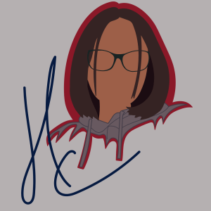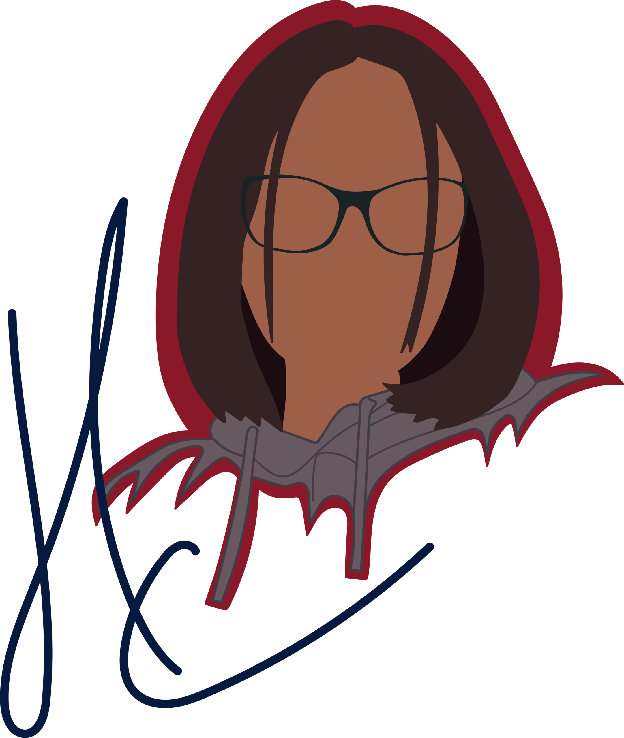
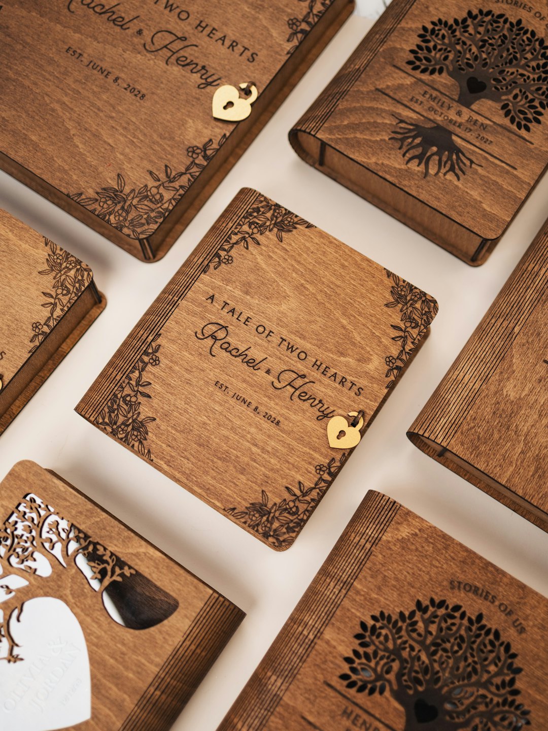
The first thing I did when creating my logo was look at different types of logos and what they mean. I compared the logo I already had (right) to what I want the logo to look like.
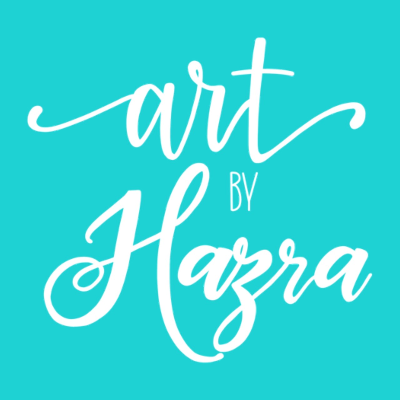
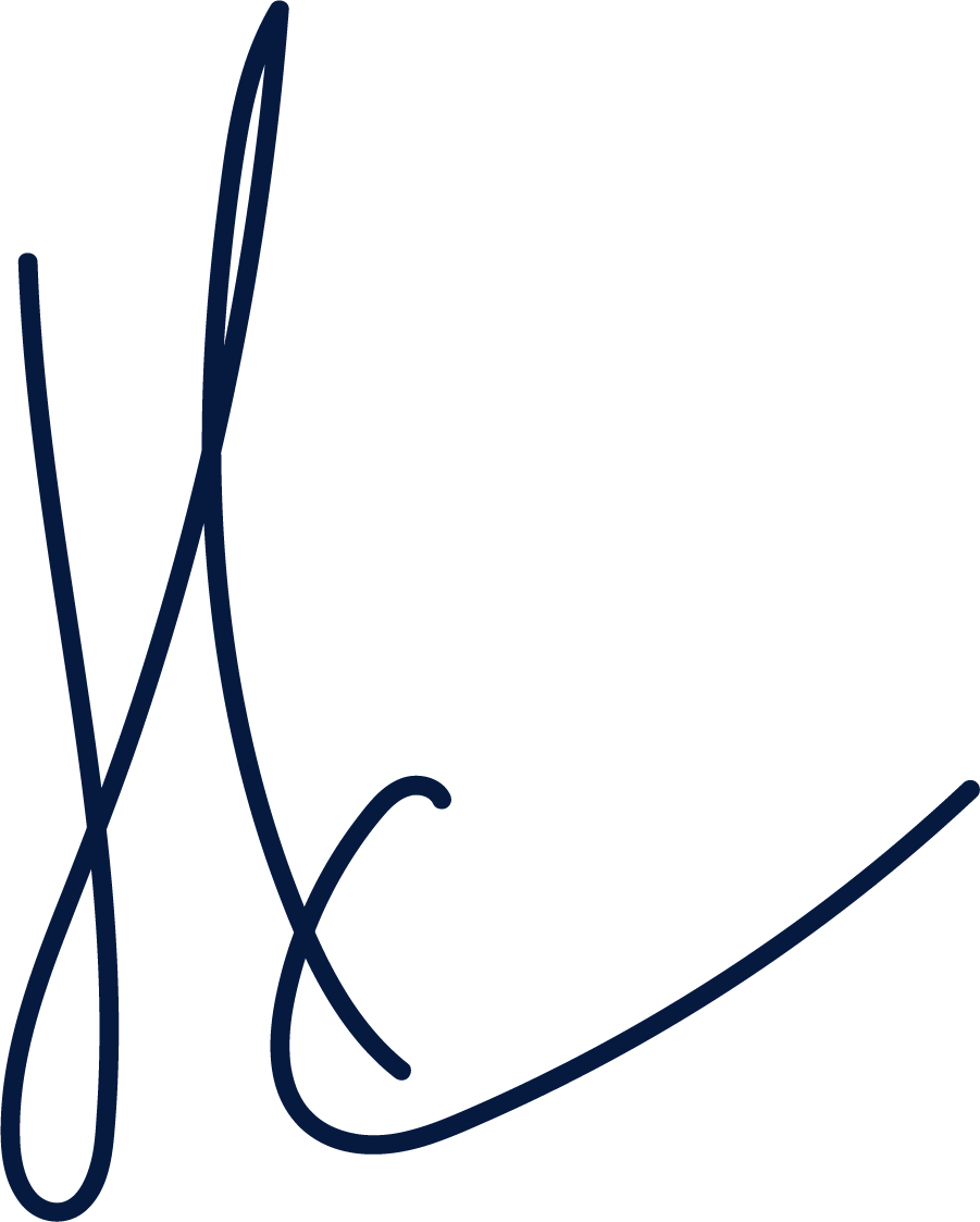
I then experimented different word and letter mark logos as this would best showcase my skill in typography. I applied different typefaces, effects and strokes but in the end I wasn’t really happy with any of these. I was thinking of having a hand written style signature like a word or letter mark, and I liked how my initials looked in this style.
I got told that some of these don’t show my style, they said that it could do with colour, they said they liked the different typefaces in my name, however if someone doesn’t know who I am then they are left wondering what I do and who I am.
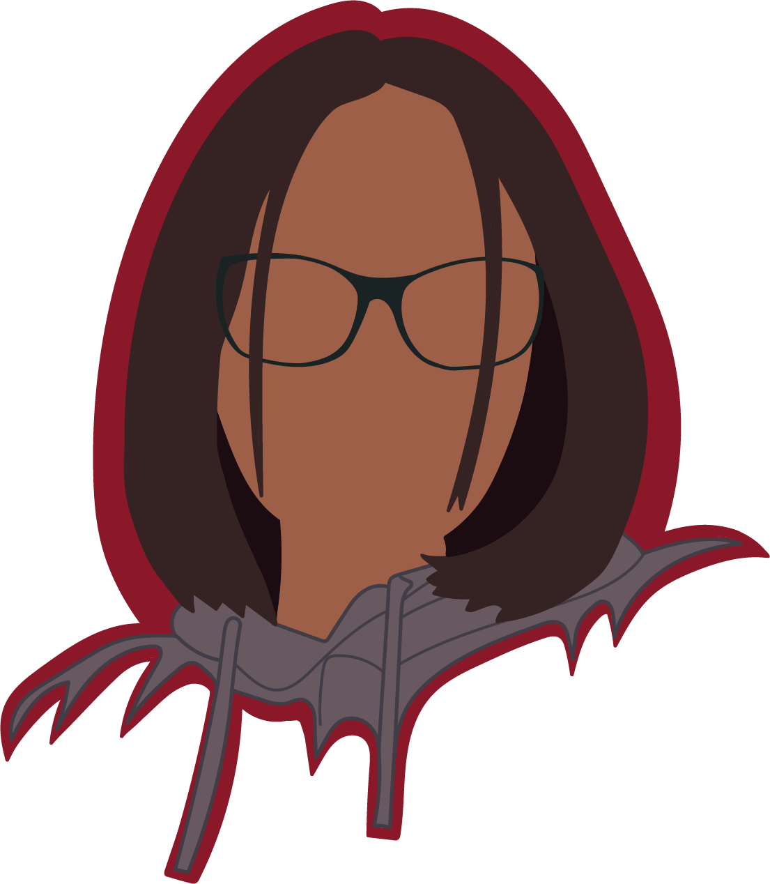
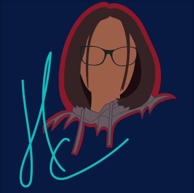
I then looked at what kind of art style I work in, rather than things that I show interest in. So below are some drafts of a new logo. This is a combination mark, of a pictorial/ mascot and a letter mark. I took an image of myself that I liked, that made me look friendly and I drew myself with different styles of the faceless art that I draw in.
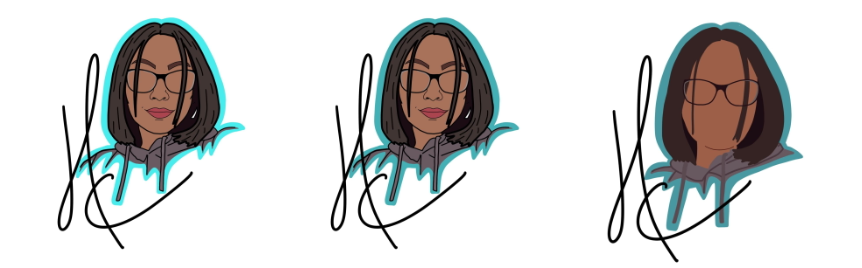
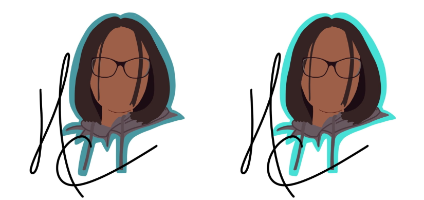
I combined the drips of my hoodie from the first two with the faceless art style in the last image. With these two logo drafts overlapped, I traced over them with the paintbrush tool in Adobe Illustrator.
I have chosen a specific colour palette for my branding. The majority of my branding for my business is already in a colour called Verdigris. Because of this, I am working around this colour for me overall palette.
Hex: 4EBFBB
RGB: 78, 191, 187
Verdigris
Hex: 8B1828
RGB: 139, 24, 40
Burgundy
Hex: 061A40
RGB: 6, 26, 64
Oxford Blue
Hex: FFFFFC
RGB: 255, 255, 252
Baby Powder
I applied these colours onto my logo and parts of personal branding like this website and my CV. The colours below are that of my logo. Two colours from my colour palette, and the rest monochromatic colours from the original photo of me.
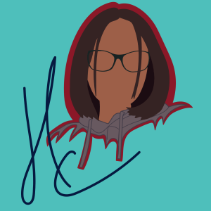
Hex: 8B1828
RGB: 139, 24, 40
Burgundy
Hex: 685960
RGB: 104, 89, 96
Wenge
Hex: 352323
RGB: 53, 35, 35
Bistre
Hex: 1B0C12
RGB: 27, 12, 18
Licorice
Hex: 9D5F48
RGB: 157, 95, 72
Redwood
Hex: 423C47
RGB: 66, 60, 71
Jet
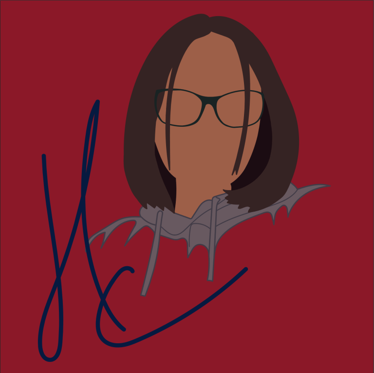
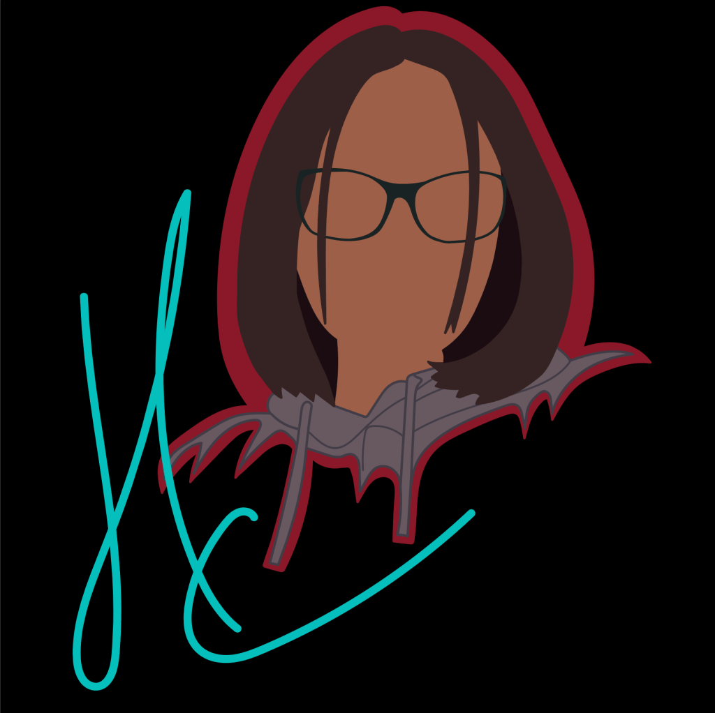
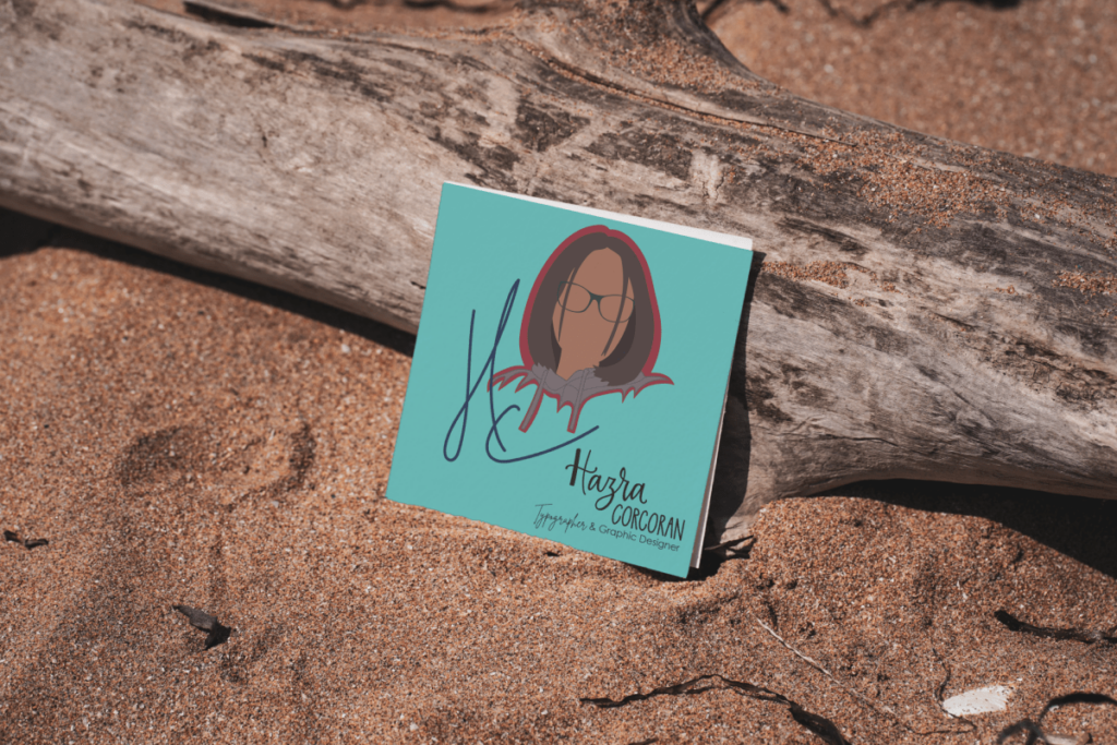
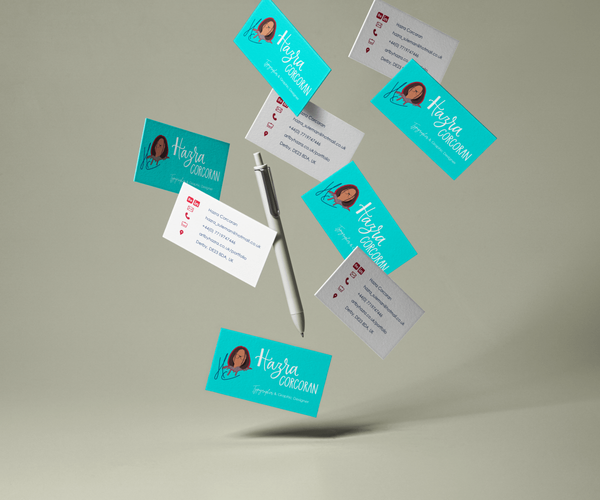
Comparing and changing the logo to suit different backgrounds